
Summary
Client: Under Armour (UA)
Project: Multi-brand Design System & Journeys Role: Project Design Lead Salesforce Cloud: Salesforce Marketing Cloud (SFMC)
Other Designers: Jonathan Vessely
|
|
How might we improve our customer communications for our users with accessibility needs, and create a flexible, scalable system for our employees to leverage in our daily communications.
Creating a Reusable, Flexible, Pre-approved Modular System
Under Armour’s disjointed and neglected system of email design needed to be brought into alignment with their newly established in-store and online branding. Under Armour was still sending majority image based content to their customers inbox awhile seeing poor performance on mobile devices, in dark mode instances, and email service providers with images automatically blocked.
|
Before
Disjointed Image Based Creative. Various fonts, CTA Styles, and overall brand guidelines. 
|
After
Modular, responsive content areas, featuring on-brand design elements. 
|
Project Output
90+ UA Branded Module
Pre-approved and pre-coded for SFMC content builder.
UA Transactional Emails
The initial test of the design system, applying it to the Under Armour transactional email creative.
Design System Evolution
Map My Run Welcome Journey, and two dynamically driven journey projects for My Fitness Pal expanded upon the base design system.
|
Research Output
Consolidated documentation of our research findings during the design system discovery.
Dynamically Driven Content
Modules driven by shopping history, loyalty status, and order status.
Living Documentation Site
Web based documentation site to be governed by the Under Armour team.
|
Under Armour Testing
Identified in discovery was an opportunity to overhaul the entire Under Armour shopping experience, from notification types to customer touch points. With this, the Salesforce Team worked with Under Armour to leverage dynamic content and data to create an updated inbox experience.
|

|

|
Recreating a Welcome Experience
Our first step into expanding the Under Armour design system after its initial launch was with their child brand, Map My Run. Although the branding only required minor tweaks, it helped prove to the Under Armour team they could continue to leverage the design system for other brand's communications.
|
|
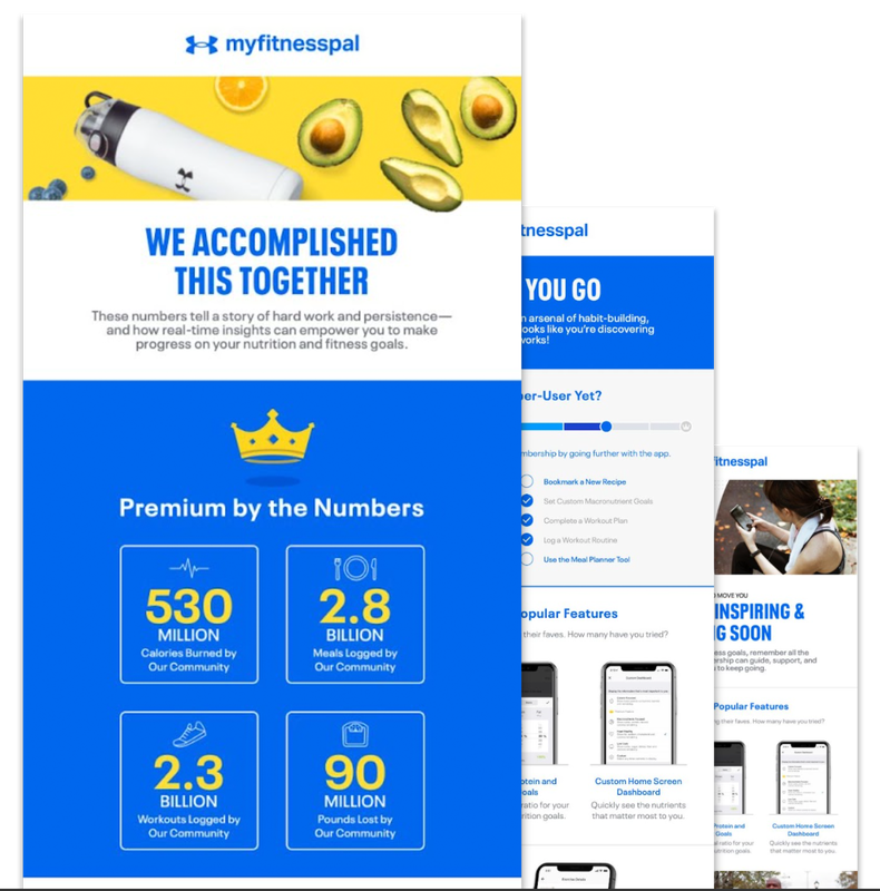
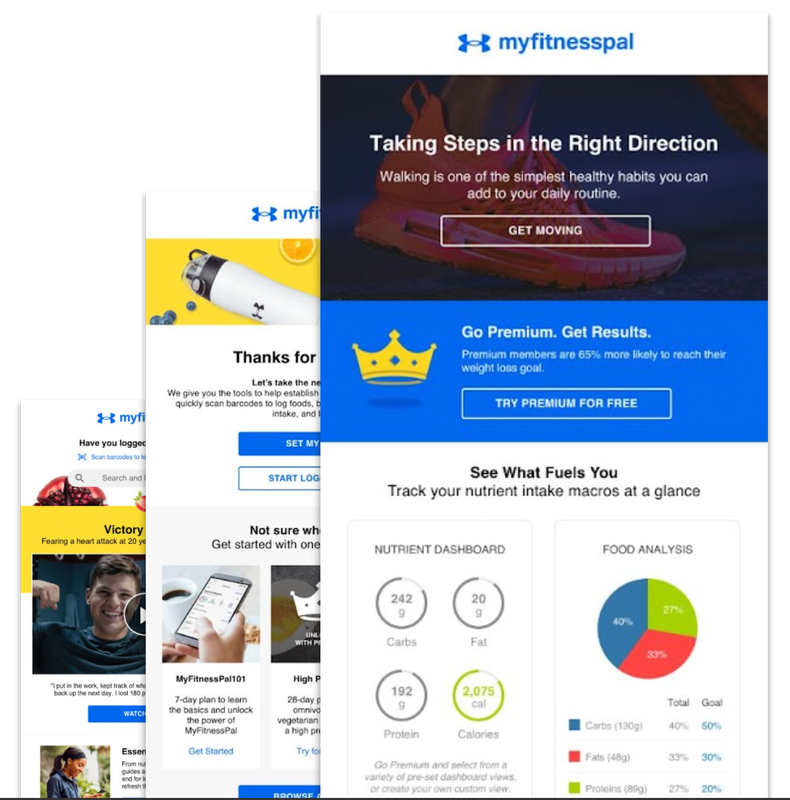
Pushing The System Further
We took the nest step into pushing the design system by stylizing it towards My Fitness Pal (MFP). This project came with the addition of new highly dynamic modules and a request from the MFP team that these modules to fit into their current framework.
Due to this we had to scale down every module to a new width. Because I prefer to build on an 8px grid system, the transition from 720px wide for UA down to 640px wide for MFP was a fairly simple process. |
|
A Surprise Result
I received an award at Salesforce after an the extremely successful design system implementation across Under Armour’s brands.
|

|